Welcome to part two of our series on Lightning pages. Today we will talk about some of the options you have for using Conditional Visibility to control some components on your page and how these might wrap into an example business process.
We have already looked at how to customise Lightning record pages and talked about a few of the components available to add to them. If you have not seen it yet, click here to get up to speed.
Conditional Visibility allows you to specify when you want a particular page component to be visible. We can use this to customise our pages to make information appear when it is relevant to the business process, and be hidden when not, so that we can keep the page as simple and concise for our users as possible. Conditional Visibility makes it easy for administrators to build flexible solutions without the need for in-depth Salesforce development.
Approvals
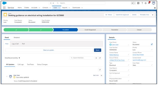
In the very simple example pictured below we have a complaint Case where one of our customers unfortunately received a faulty widget. The complaint handler has processed this and decided that a credit should be requested so we have the page set up to display the Approval History related list in a prominent place on the page only if the record has ever entered an approval process. In this way, complaints earlier in the process, or resolved without any action that required approval will have the approval history displayed with their other related lists like normal, but those that have actually been in the approval process will have it front and centre so it is very easy to track the progress and outcome.
Before approval submission:
After:
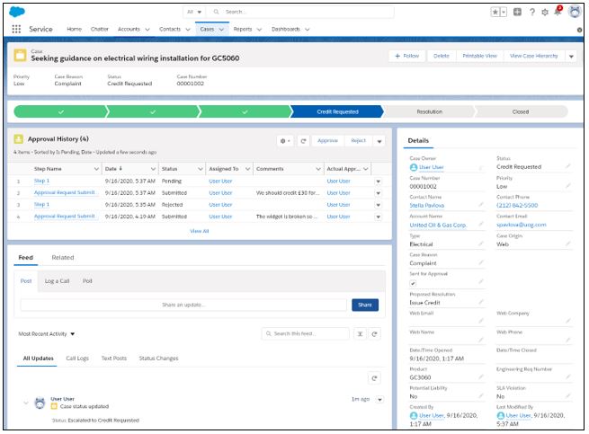
We’ve made it really easy for anyone who visits this record to see that it has some involvement in an approval process and for the approver, the approve and reject buttons are right there at the top of the page ready to get this case closed.
Depending on how you set it up you could make the approvals list disappear back within the other related lists once the approval process is complete, leave it there, or something different altogether depending on what is most relevant to your team.
Customising by form factor
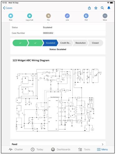
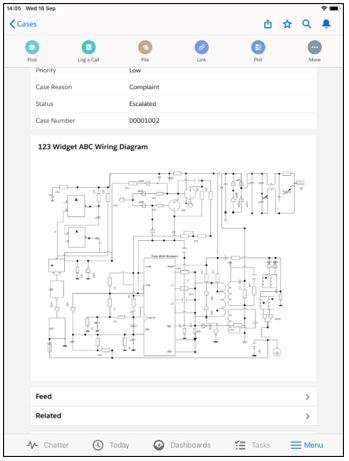
We will use the same case as the example here. Imagine that a few days earlier we had one of our engineers go out to see the customer to diagnose their troublesome widget. Our field engineers all use iPads to read notes and update cases while they are on site with customers. We could use some other lightning page customisation options to be able to have the same page behave differently depending on what device type it is being viewed from. Here, we have customised the case page to show the wiring diagram of the widget so that the engineer can easily refer to it while on site. While this may be a useful resource to a customer service agent back in our contact centre, they are unlikely to be able to make good use of a complex wiring diagram over the phone so we have the diagram set to only appear when accessing the case from a mobile device so as not to fill the screen of office based staff from whom it is less useful.
This is a simple example but you can see how given the size of this image, you really don’t want it there unless it is useful as it just gets in the way, but for the field engineers, having the right information right in front of them at the top of the page as soon as they open the case saves them a lot of time.
We could take the example further here. In the iPad screenshot above, the Path component is of minimal use to an engineer on their iPad and takes up screen space, so perhaps we should hide it on mobile devices. To do that, we edit the lightning page and select our Path component. Expand the Conditional Visibility section and click add filter and you can configure something like the screenshot below to make sure the path component only shows for Desktop users.
There is a lot of power here to use a single lightning page with small variations to enhance the user experience. Bear in mind that it is possible to have multiple lightning pages so if the pages need to be dramatically different it may be better to just create a separate page and assign it to the users or devices it is for, so think about the best way to achieve your aim, not just for now but in 6 months’ time when you have to come back to make more changes and need to be able to easily understand what has already been done!
Warning Messages
The final thing we will talk about today is how to use Conditional Visibility to create warning messages or banners so that your users cannot miss important information when accessing a record.
With so much information available about our customers and often complex business processes combined with busy customer service agents, it might be easy for one of our team in the example used above to not realise that this customer has made a complaint. This might mean they do not manage the situation accordingly. We can make this easier for them with some very simple use of the Rich Text component. While basic, this is very quick to do and makes it harder for busy staff to overlook important information.
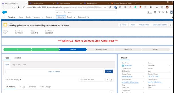
The above uses the Rich Text component and conditional visibility to make a simple text banner appear on selected cases. The rules behind this can be as simple or as complex as you like, but the component used is available as standard in Salesforce and very easy to use.
We can take this a step further. In the example below we have used a slightly more advanced process to display a banner on the Contact record for the customer who made the complaint. This helps our users who are interacting with the customer know that there is a complaint underway. Even if they are speaking to the customer about a different case or opportunity this is good to know as they may be able to help resolve the complaint, or maybe tread carefully around certain subjects now that they know the customer has been unhappy. The warning here is a small custom Aura component to demonstrate a different look.
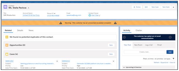
On the right-hand side, we can see a similar component in use again, this time just above the email action to remind staff that this customer has opted out of email communications.
There are lots of options here to use data within your records to produce highly responsive pages that put what people need to know in front of them when they need to know it. As always, the most important thing is knowing what the possibilities are so that you can factor them into your planning.
Why not contact us to know more about the possibilities.