Over the past couple of years we’ve seen big changes to page layouts and Lightning pages, which might seem overwhelming or confusing. This is the first of a multi part blog series on how you can use Lightning pages and the flexibility they can bring you, without jumping into heavy Salesforce development. Let’s start with understanding what makes up our Lightning pages.
Firstly, we’ll take a look at some of the standard components provided by Salesforce for a record page. There’s plenty to say here and a lot of them are self-explanatory, but some need a little more understanding to be able to set up successfully. I’ll also mention a couple that I feel are often under used, mainly because they seem to have such an obvious use, but you can actually do much more with them.
Record Details – this component gives you access to the page layout as defined on the object. Whatever fields you have set to display on a user’s page layout will display wherever you put this component.
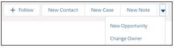
Highlights Panel – This does two jobs. Firstly, it displays the compact page layout for the record and displays the actions and standard buttons from the Salesforce Mobile and Lightning Experience Actions section of the page layout. More than ever here the order of buttons matters as by default it shows three buttons and the rest will gather in a drop down. Think about whether it might actually be useful to have the delete button in the drop down where it's hard to hit it accidentally and arrange your actions and buttons accordingly. You can configure the highlights panel to show up to 10 buttons before creating a drop down so the order of the buttons can mean you can keep the most regularly used actions on the bar with less common ones in the drop down.
Path – This one is really clever. When path is enabled it can use a picklist field to display a graphic. This is great for showing progress through a process. A few things to think about here are the order of the values and the number of values in your picklist. A larger number of values makes the graphics less useful as your users won’t be able to see the text at a glance as each value will get truncated. Likewise, most people (here in the UK at least) expect things to run from left to right like when reading, so you’d want to make sure your picklist values are arranged so that most records will flow from left to right on the path component.
For example, displaying the status of a record going through a review process you’d want fully reviewed and no further work needed on the right while ‘draft’ or similar on the left. Keep the entries here simple. To do this, think about whether a separate status detail or status reason field should be added. Values such as “With Ops”, “Finance check requested” and “Docs Prepared” that are actually just different flavours of “In Review” could go in the new picklist field and keep the status displayed in the path component simple and useful to anyone to get at a glance information.

Related List – Single - This is another interesting one. First and foremost, it does what it sounds like, it adds a single related list to the lightning page so you can put it wherever you’d like. It actually has a fair bit more power than that these days as it can be configured to display a list from a parent record. This means, for example, that you could be on a Contact record and see all the activity history from its parent Account, and even log calls or tasks etc. against the Account right from the Contact record.
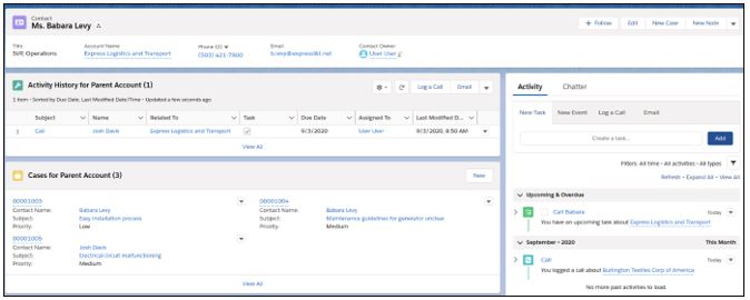
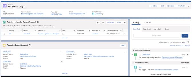
Recent Records – This one has some interesting uses and is often relegated to only being used on homepages as a place for staff to arrive first thing in the morning and quickly pick up where they were yesterday. This is a great use case, but it can do so much more. We can put it on a record page to make switching between the records you are working on easy. In the example below, we’re on a detail record that sits under a Contact and we can easily jump between the Accounts and Opportunities we were just working on when processing this sale.
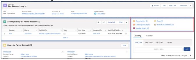
Related List Quick Links – This is a great one if you’re looking to save some space on screen. It adds a small section that you can put anywhere on the page with a link to click that will take you to each of the related lists in a full screen view. If you hover over the title a pop up will appear with the details for a quick look. One of the nice things is that this displays the record counts (the number in brackets) all in to one place easy to see without clicking between tabs or scrolling.
Templates
Now that we have covered some of the more common and useful record page components, let’s talk about templates. Pages can have different types of setup with different sections in various arrangements. The screenshots above use a template called header and right sidebar which has a full width section at the top of the page, and then two columns below but the right-hand column is much narrower than the left. Different layouts suit different use cases. The one mentioned above is good for what you might call your core records – like Accounts and Opportunities. Records where there are likely to be a lot of information, a lot of related lists and regular updates. Some of the single column layouts may be better for supporting records such as Opportunity Line Items which don’t store the same amount of information. Getting the right template is important to helping your users be able to see what they need on the page without overwhelming them with information or making some items so small they cannot be easily seen. This in turn enhances the user experience and drives Salesforce adoption.
Activation
Once you have created your perfect record page, you need to activate it for at least some of your users. The most common setting here is just simply to set it as org default for desktop and mobile. This will mean that everyone who accesses this record will arrive at the same page regardless of who they are or what device they are accessing Salesforce from. Generally, this keeps things simple to administer and problems easy to track.
There are other options, however. A common one I use is to give managers who might be responsible for approvals a different page which puts the information they need to review right in the centre, with perhaps the related list for Files just next to it. In this way the manager can check the paperwork and the data on the record easily without having to scroll past logs of calls and tasks that they may only care about if there is a problem. In this use case, you could also add the related list of records awaiting approval directly to the record page so that they can very easily jump to approve the next record right from the screen they are on without having to first go back out to another view.
Defaults for different form factors are also well worth consideration. A form factor controls which device this page will be available on. Your desktop users may want a large map on the record page along with an integration into another system that is perhaps only available in your office or via VPN. For mobile users these things may not work well or only get in the way. Perhaps for mobile users the photos they take while visiting a customer are key, so putting the ability to add and view those in a prominent place at the top of their page makes more sense than having the long list of record fields appearing first.
Lightning pages are so flexible and are only getting more so with each release from Salesforce. These are just a few ideas and considerations when putting together pages. There are lots more ideas that you might be able to come up with and find when looking around the community.
Why not contact us to see what else can be done.